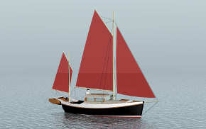
Sailing Yacht Proportions
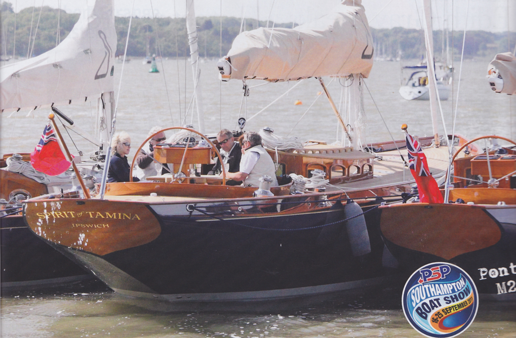
The first fundamental of great design is basic proportions, if you get those wrong the rest is just window dressing. I was stunned to see a full page ad in the latest Classic Boat featuring really bad proportions. See the new 56′ from Spirit Yachts above. Everything is wrong, the sheer is too high, too flat, too pinched aft and too full forward. The high topsides and full shape accentuate the too flat sections. To get away with this deck height it must be wrapped in far more shapely surfaces…..someone (no design credit given) wasn’t paying attention to their 3D computer model, which is why we have this stuff.
The deck is too flat, if it had more crown the sheer could be lower…..Then the house is just bad, a twisted top with a dip (?) in the roof and too many tiny “Doppler effect” windows……As for detail the pedestal is completely wrong….a square box with a rectangular box on top is far from elegant, and instrument faces pointing at the sky are useless…….It appears the only thing to hang onto in the cockpit is the steering wheel!
-
External Links
- http://forum.woodenboat.com/showthread.php?139956-Some-thoughts-on-beauty-and-boats
